Work / Case study
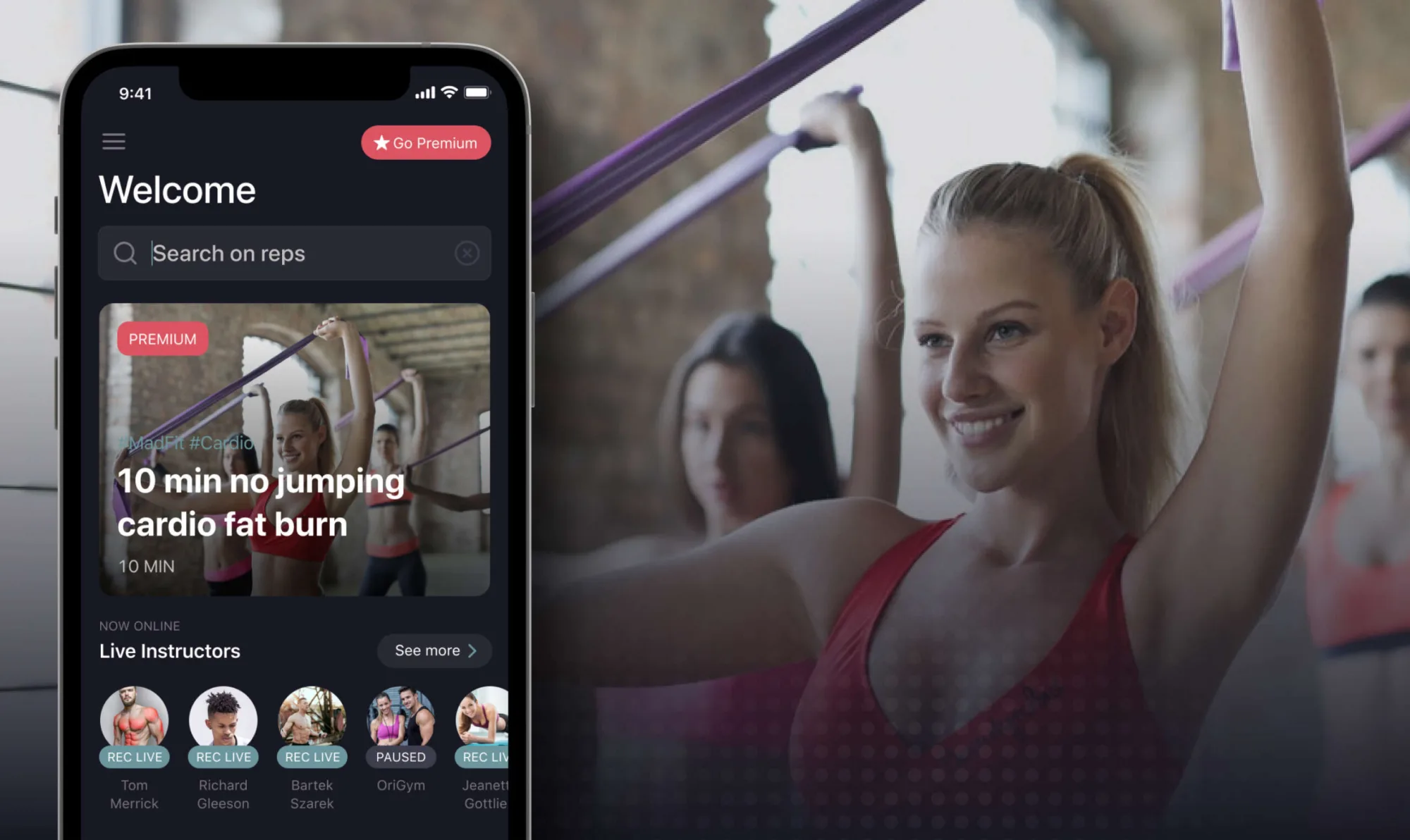
A mobile app that curates the best workout videos and fitness creators into one easy-to-navigate experience — tailored to user preferences, skill level, and available equipment.
With the closure of gyms during the COVID-19 pandemic, millions turned to home fitness. The internet was flooded with content — yet discovering high-quality workouts from trusted trainers became overwhelming. As a fitness enthusiast myself, I experienced this friction first-hand.
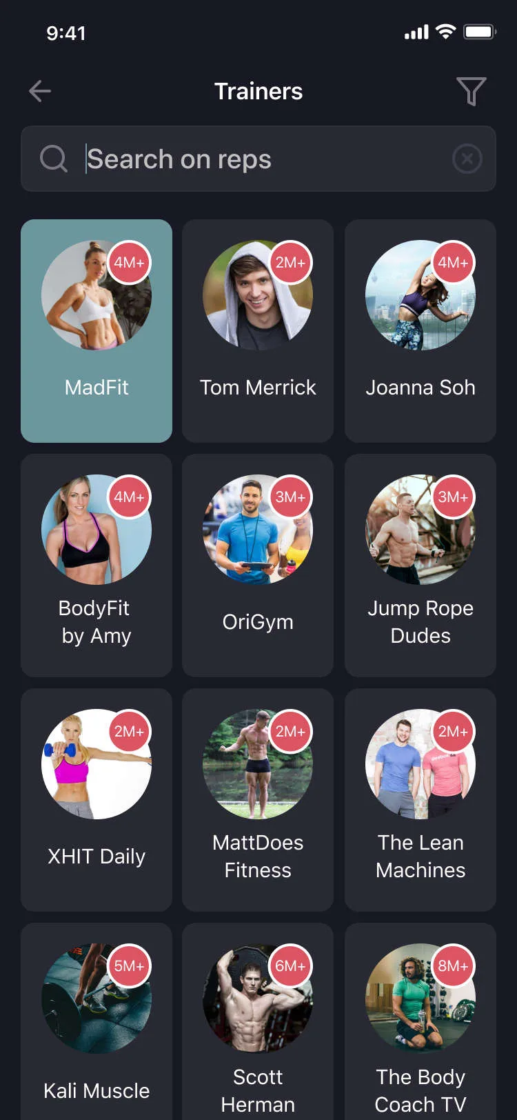
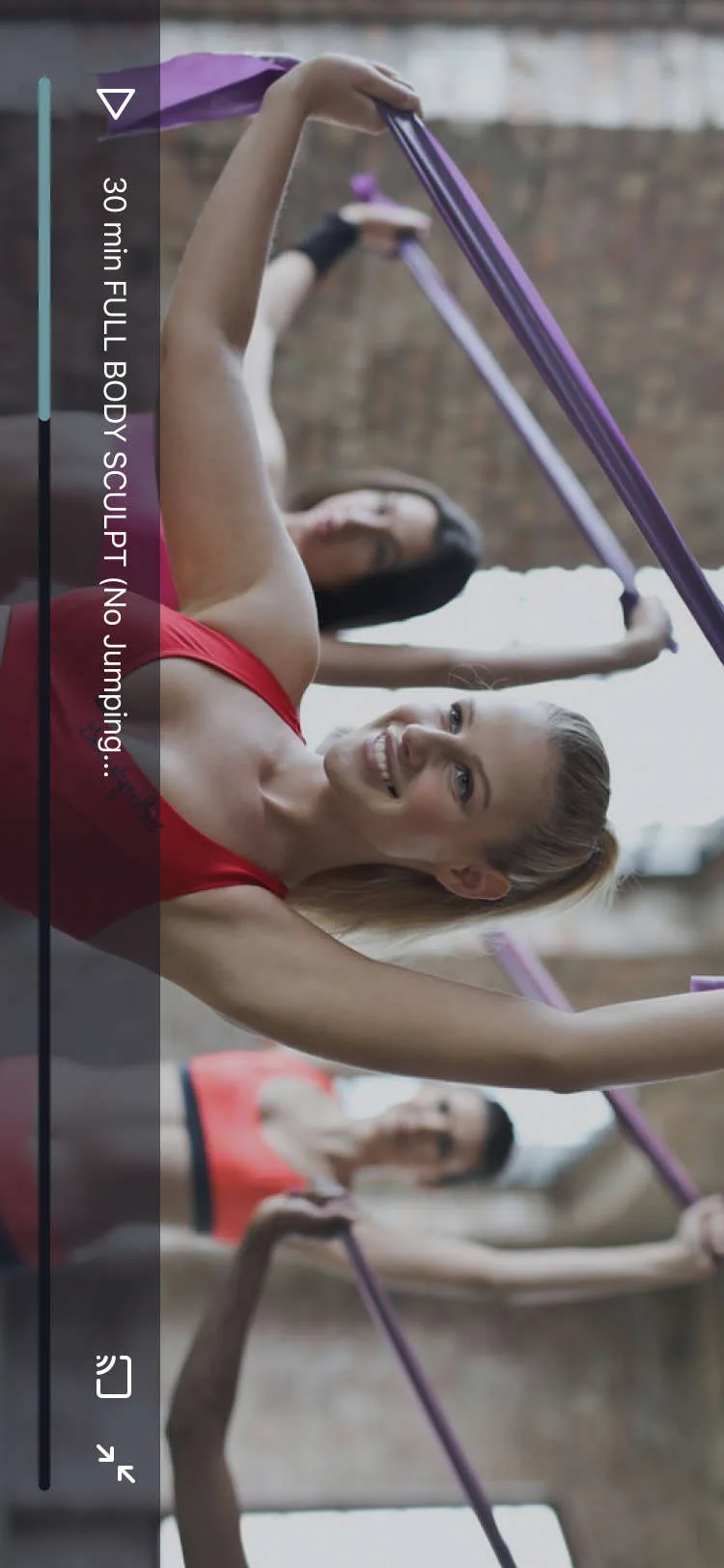
Reps is a mobile app designed to solve that problem: a curated platform that consolidates the best workout videos and fitness creators into one easy-to-navigate experience — tailored to user preferences, skill level, and available equipment.
Build a simple, effective tool to help users:
Value proposition: the fastest way to discover quality home workouts that match your fitness level and lifestyle.
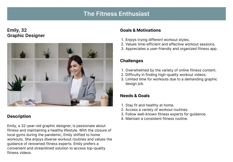
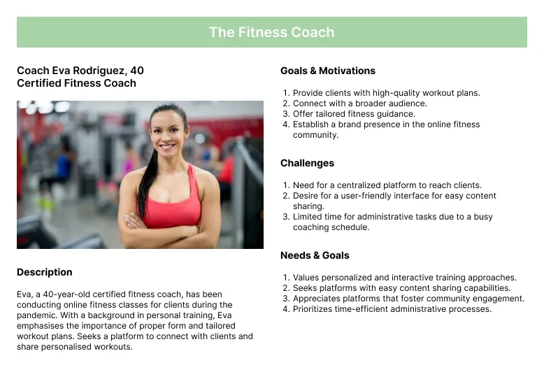
To guide feature priorities and design decisions, I created provisional personas:
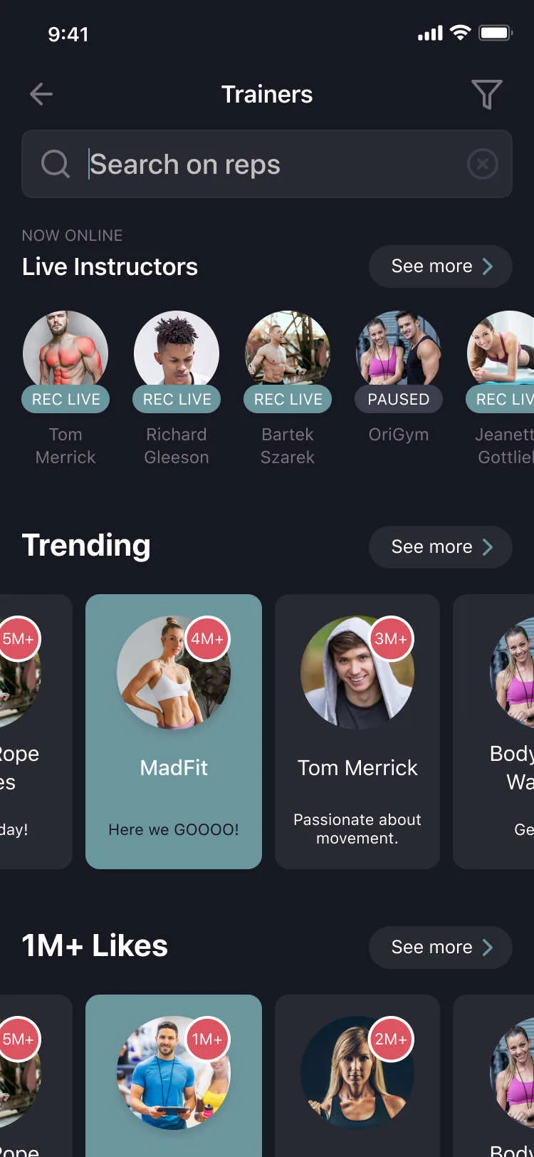
These personas helped define the experience from both sides: the content consumer and the content creator.
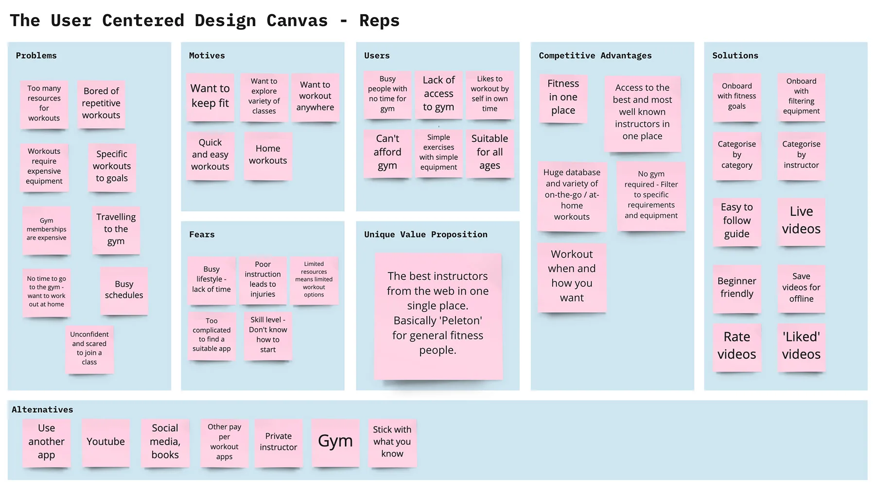
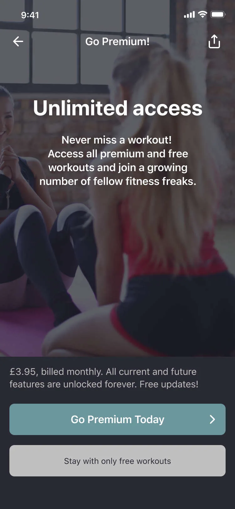
Using a Miro board, I mapped user pains, goals, and opportunities alongside business considerations like monetisation (e.g. freemium model, creator revenue share). This clarified the core value for both users and the business.
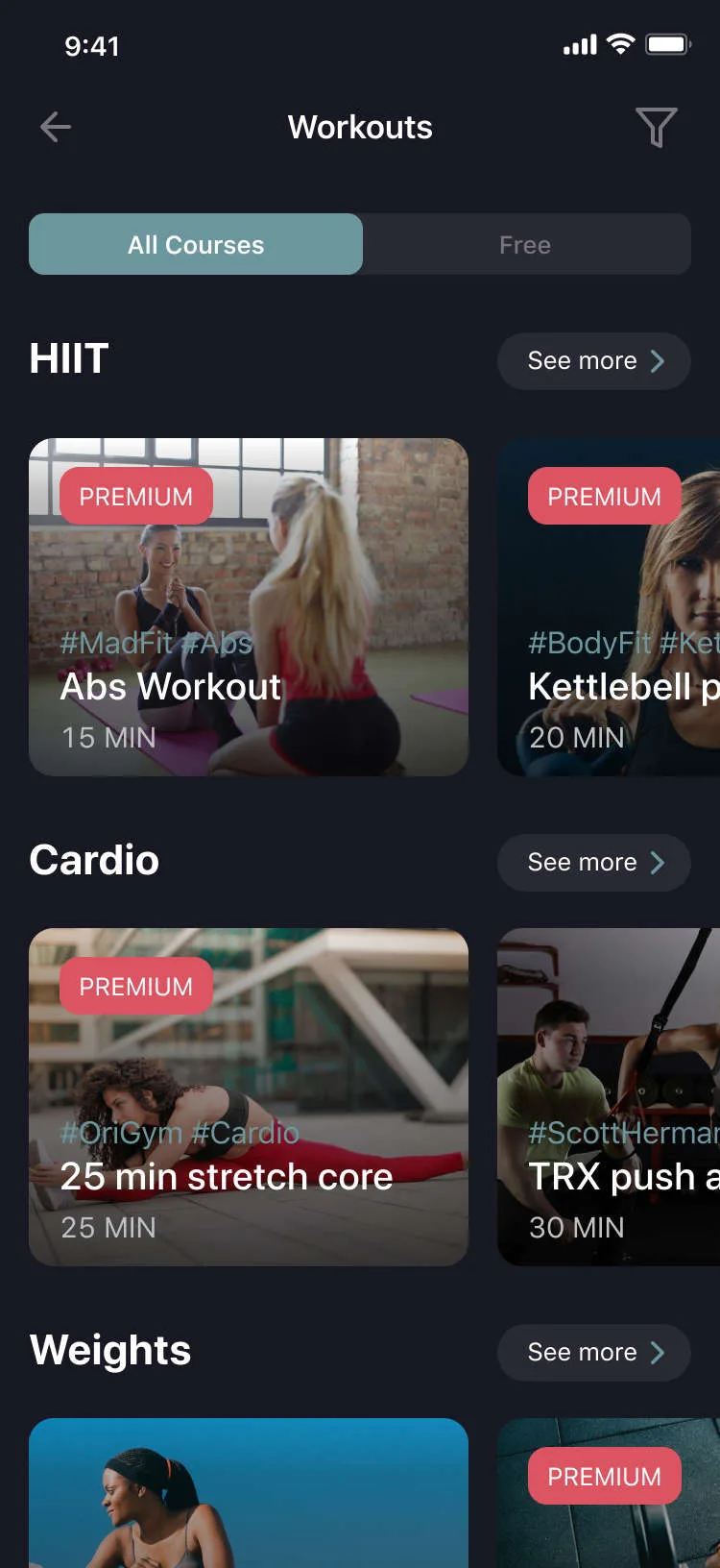
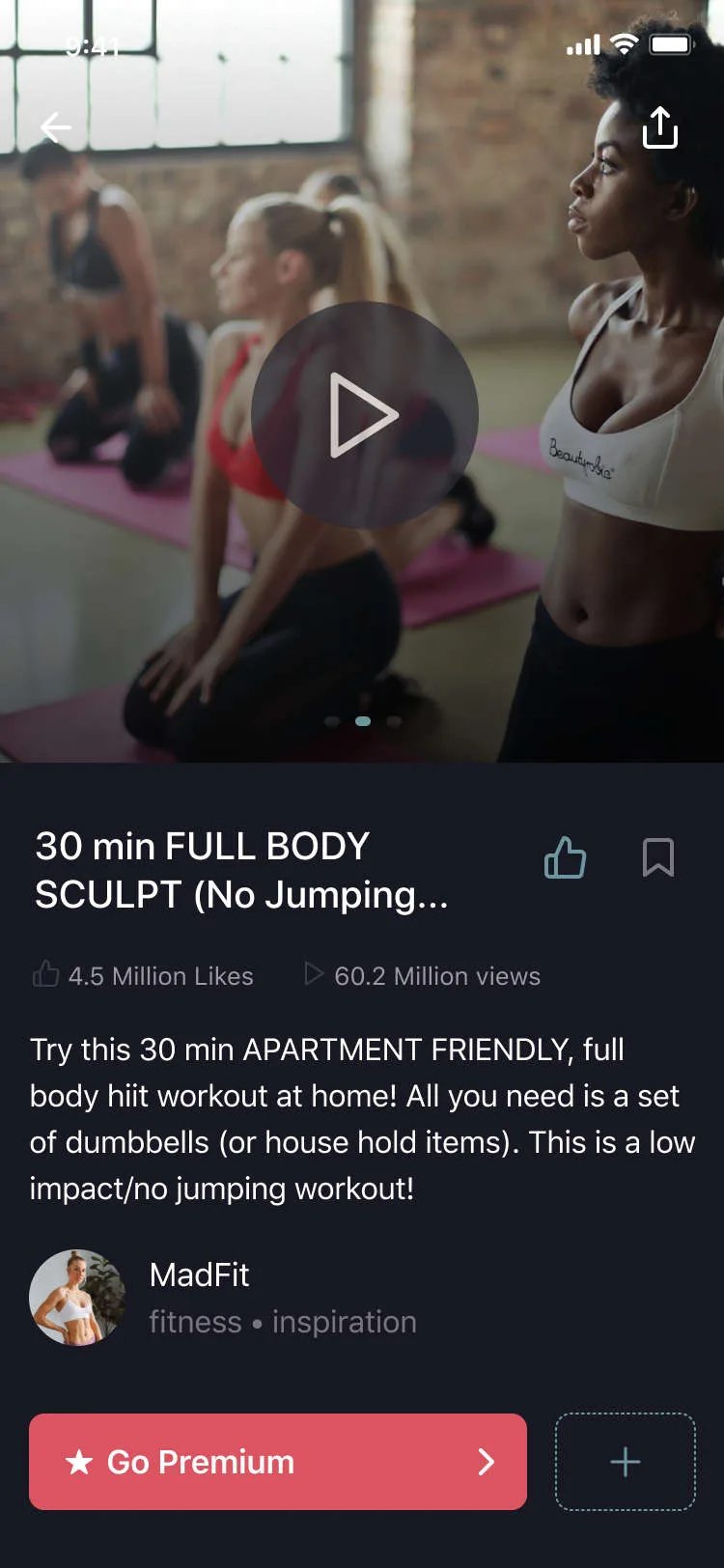
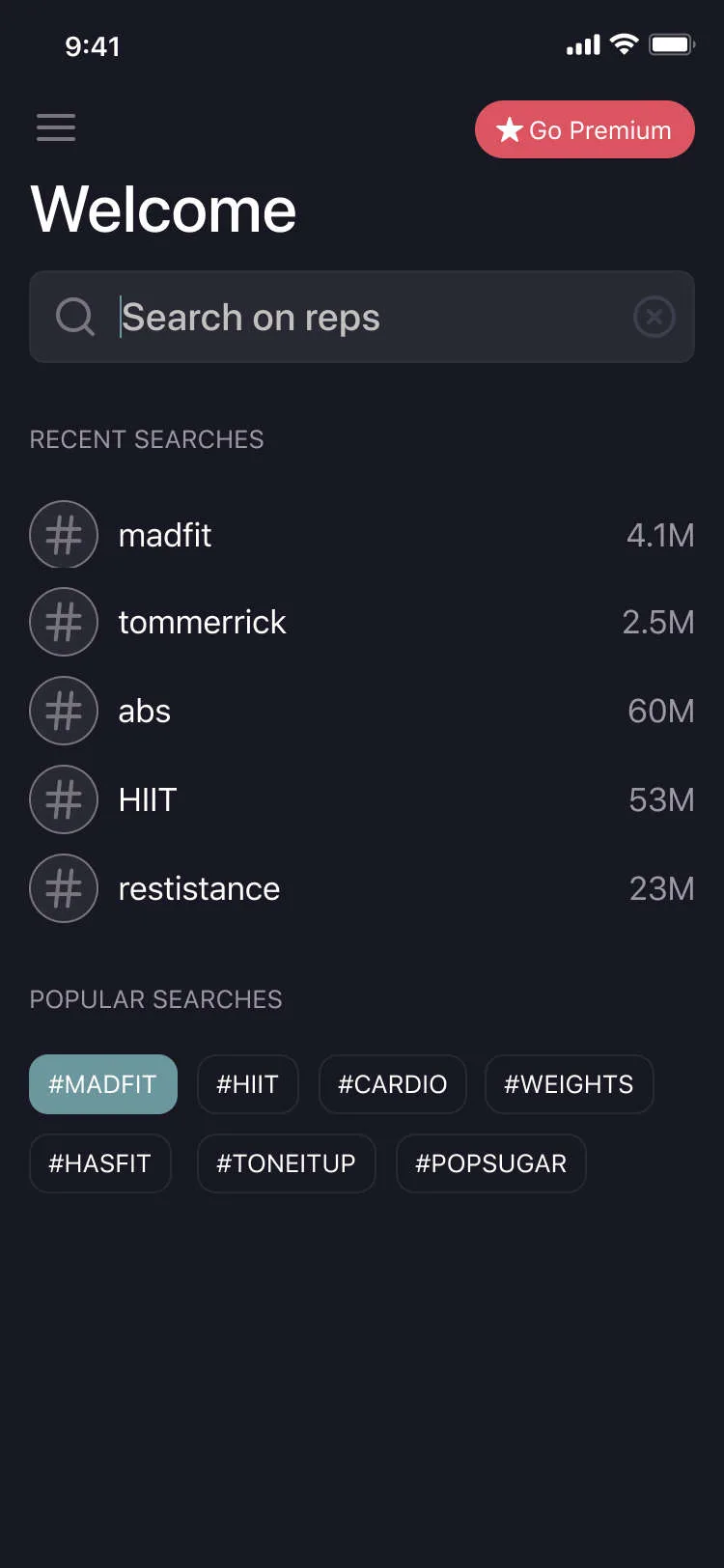
The Minimum Viable Product focused on simplicity and real utility:
Nice-to-haves: calendar & scheduling, trainer profile pages, workout programs & series, social features, and offline mode.
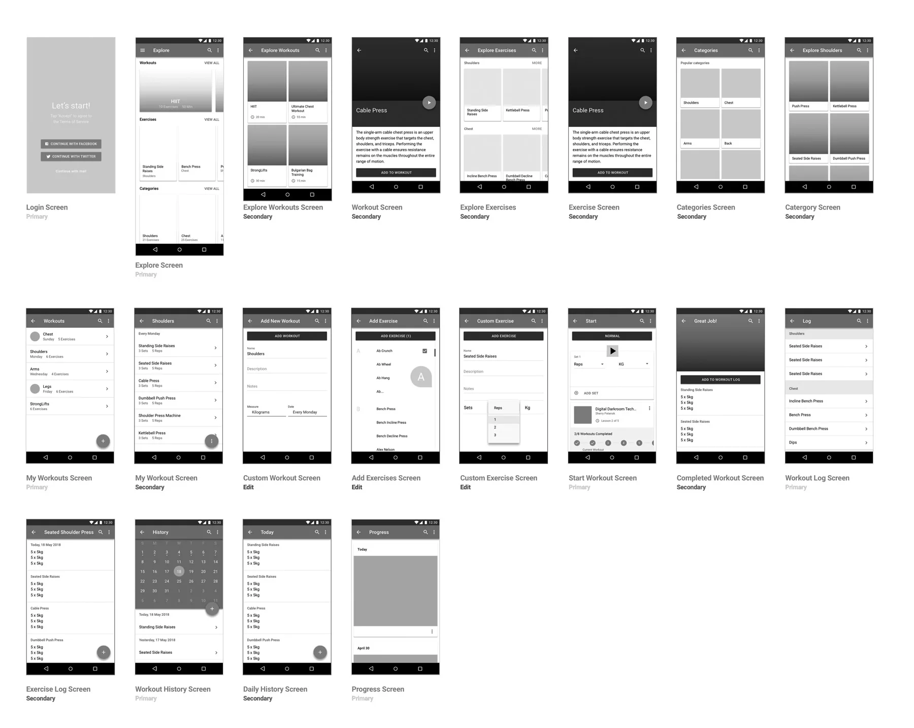
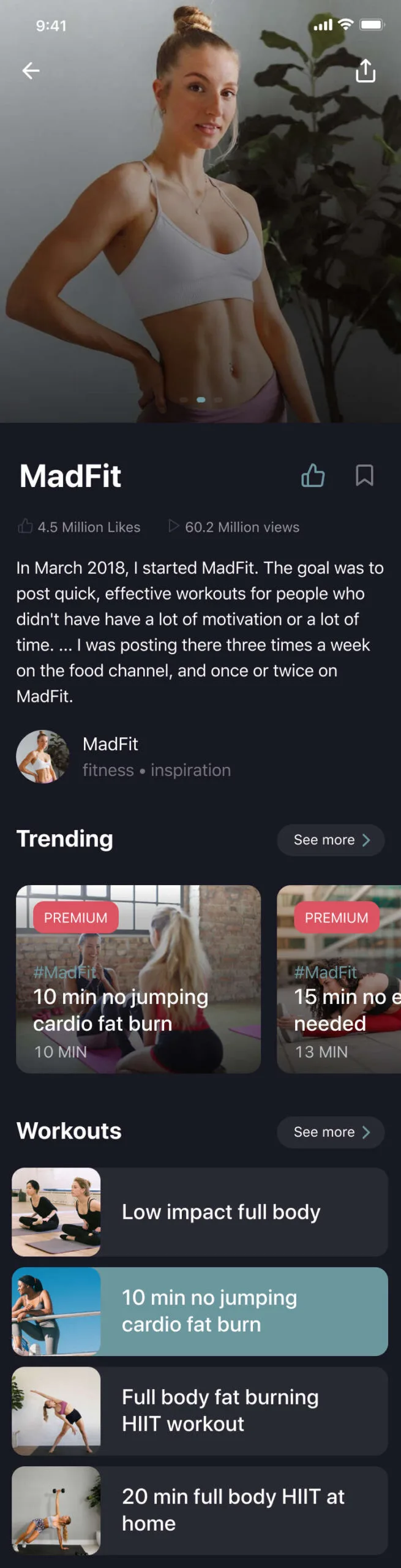
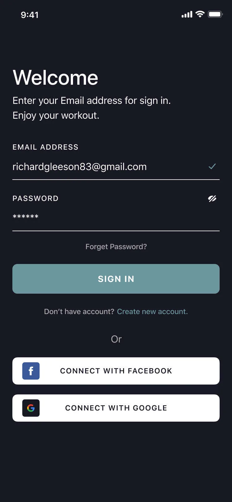
I started with low-fidelity wireframes to explore layout and user flows — onboarding for fitness goals, a browse page with smart filters, workout detail with a call-to-action, and profile & favourites. These helped validate the navigation logic and content hierarchy before moving into UI.
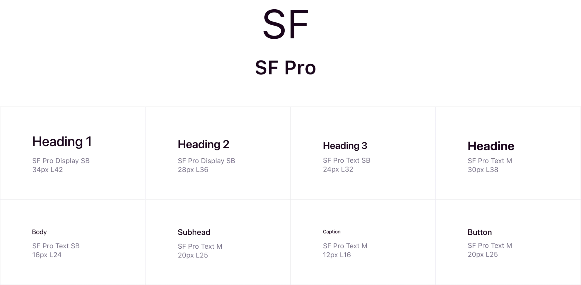
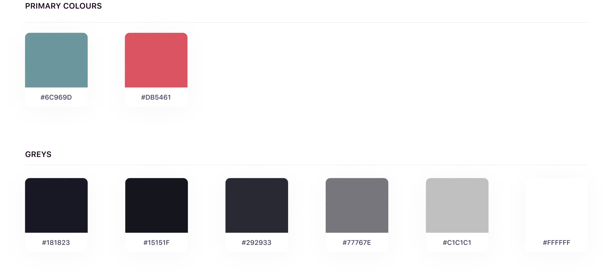
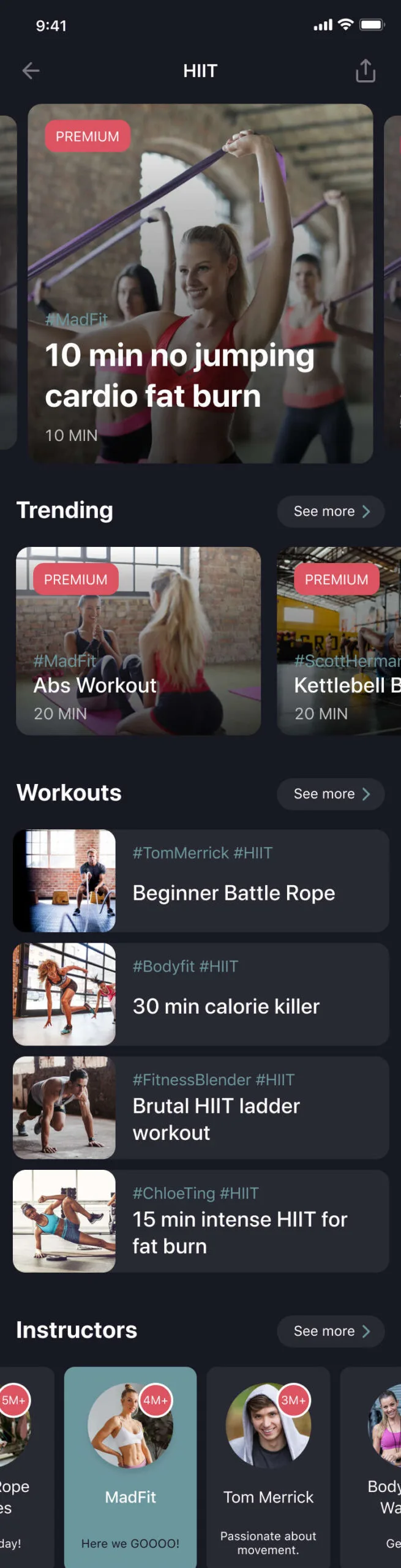
The visual design draws inspiration from modern fitness brands — energetic, clean, and bold.
Reps is a concept rooted in real-world need and shaped through a user-first lens. The project deepened my experience in defining MVPs, balancing user and business goals, and building scalable design systems for content-rich mobile platforms.
If you need design support — or think I'd be a great fit for a role — I'd love to hear from you.