
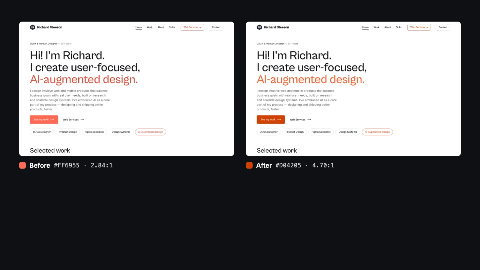
I tell clients that every site I build starts from a proven design system and gets fitted to their business. It's a fair question whether I'd done that properly on my own site. I hadn't, quite, and a measurement showed it.
Where the system came from
rgleeson.com wasn't designed from a blank page. Its layout, type and spacing came from studying good examples of studio portfolio design: plenty of white space, oversized headlines, near-black ink and one accent colour used sparingly. That's a sensible way to start. Patterns that already work on well-made sites save weeks of guessing, and a design system turns them into rules: these colours, these sizes, this spacing, every time.
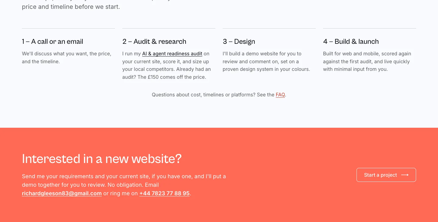
The part I'd skipped was fitting it. The site went live in June with a light coral accent, #FF6955, on every main button and on the full-width bands that end most pages. It looked good. I never checked whether people could read it.
How I measured it
Contrast is the difference in brightness between text and whatever is behind it. The accessibility standard, WCAG 2, asks for 4.5:1 for normal text and 3:1 for large headlines. Below that, text gets hard to read on a phone in daylight, for anyone with less than perfect eyesight, and for software that reads pages the way people do.
Checking a few pairs from the colour palette isn't enough, because what matters is what actually renders: text on a band, on a card, on a tinted button. So I wrote a script that opens each page in Chrome at desktop and phone width, finds every piece of visible text, works out the background actually behind it, and measures the pair. It ran on 12 pages and found 1,744 text elements. Text sitting on a photo or gradient can't be measured that way, so those 50 were listed separately and not counted as passes.
102 elements failed. 92 of them were white text on the coral: every "See my work" button, every "Send message" button, and every heading and paragraph on the coral bands. White on #FF6955 measures 2.84:1.
| Check | Before | Needs |
|---|---|---|
| White text on the coral buttons and bands | 2.84:1 | 4.5:1 |
| White text on the coral when hovered | 3.90:1 | 4.5:1 |
| Coral outlines on white | 2.84:1 | 3:1 |
| Form field edges | 1.54:1 | 3:1 |
The form fields were a quiet one. Their pale grey edge, #D0D0D0, was 1.54:1 against white, so on some screens the "Start a project" form looked like labels floating over nothing.
The options I tried
My first move was three new palettes, a teal, a green and a blue, each with a new headline font, each passing every pair. I rendered all three on the real pages rather than on swatches, because a colour that looks right in a box can feel wrong on a full-width band.

I didn't like the fonts, and once those were back to the originals, I still preferred the coral. That's a useful answer. The colour wasn't the problem; its lightness was. So the second round kept the coral and split it into two steps: a deeper shade for buttons, bands and links, where white text has to pass 4.5:1, and a brighter one for the big headline words, which only need 3:1 as large text.
I tested three versions of that: the same hue deepened, six degrees redder, and eight degrees towards orange. All three passed all 13 pairs I check. The two finalists looked like this on the band:
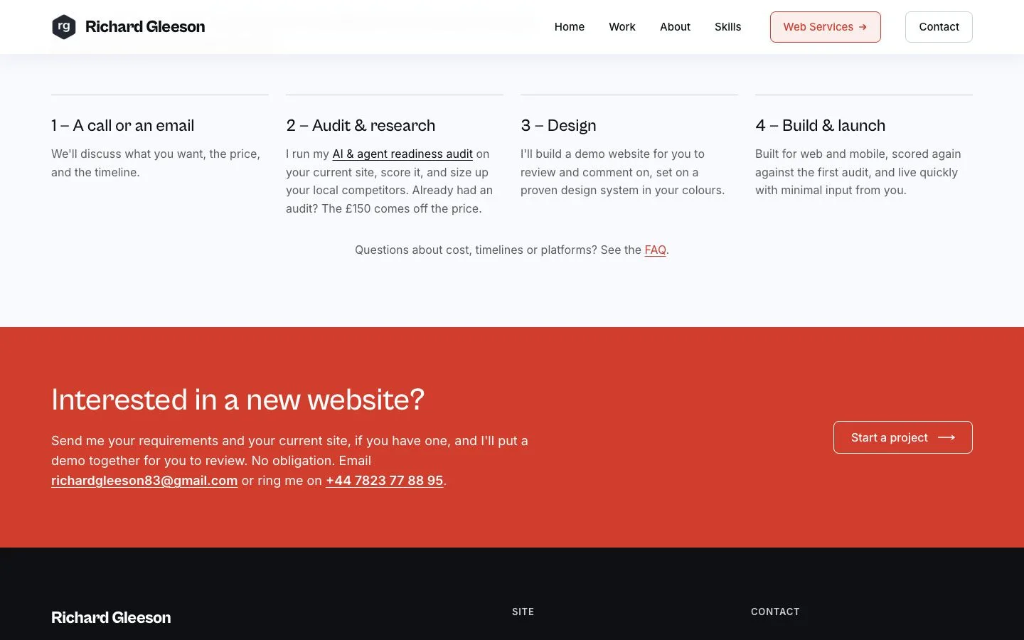
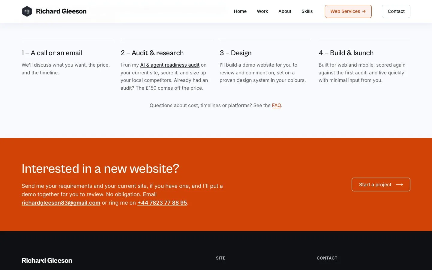
I chose coral orange. On a full-width band it's warmer than the brick-red of the deepened coral, and it makes the colour clearly this site's own.
What changed
Five colour roles changed. Nothing else did: same fonts, same layout, same copy.
| Role | Before | After | Why |
|---|---|---|---|
| Buttons and bands | #FF6955 | #D04205 | White text 2.84:1 → 4.70:1 |
| Hover | #DD5341 | #AF3500 | White text 3.90:1 → 6.30:1 |
| Headline accent words | #DD5341 | #F36435 | New bright step: 3.14:1, enough for large text |
| Links and labels | #C8402E | #D04205 | One accent, one meaning |
| Form field edges | #D0D0D0 | #8A91A6 | 1.54:1 → 3.14:1 |





The result
I ran the same script on the same 12 pages afterwards.
- Text failing contrast
- Before: 102After: 10elements
- White text on the accent
- Before: 2.84:1After: 4.70:1needs 4.5:1
- Form field edges
- Before: 1.54:1After: 3.14:1needs 3:1
- Accent hover
- Before: 3.90:1After: 6.30:1needs 4.5:1
Ten failures are left, and none of them involve the accent. Two are the same pale grey dot, a separator on the Web Services page, measured at both widths. The other eight are on my case study pages, where I reproduce two clients' own colours to show their design systems: a blue button and some grey step numbers. Those are their brands, shown as they are, and I'd rather point that out than hide it.
What this means if I build your site
The process is the one I used here. Start from patterns that already work on well-designed sites, fit them to your colours and your content, then measure the result on the real pages before launch, not on a swatch card. If your brand colour fails contrast, I won't quietly darken it. I'll show you options rendered on your own pages and let you choose, the way I chose here.
Every colour, size and rule rgleeson.com now uses is on its design system page, generated from the live stylesheet. If you'd like the same treatment for your site, here's how I work, or start with an AI and agent readiness audit of the site you have.