
Most people prompt a landing page the way they'd order a coffee: "write me a landing page for X." What comes back is fluent, confident, and completely forgettable — a wall of even-toned copy that reads like every other page the model has ever seen. The instinct is to blame the tool. The real problem is the brief.
A landing page isn't one piece of writing. It's a sequence of distinct jobs, each with its own purpose, its own structure, and its own failure mode. The hero has to stop the scroll. The sub-headline has to earn the next five seconds. The pain section has to make someone feel seen. Ask for all of it at once and you get an average of all of it at once. Prompt each job separately, against a structure that's known to work, and the model stops guessing and starts executing.
Here's the anatomy — and how to brief AI for each part so it gives you something you'd actually ship.
Start with the structure, not the copy
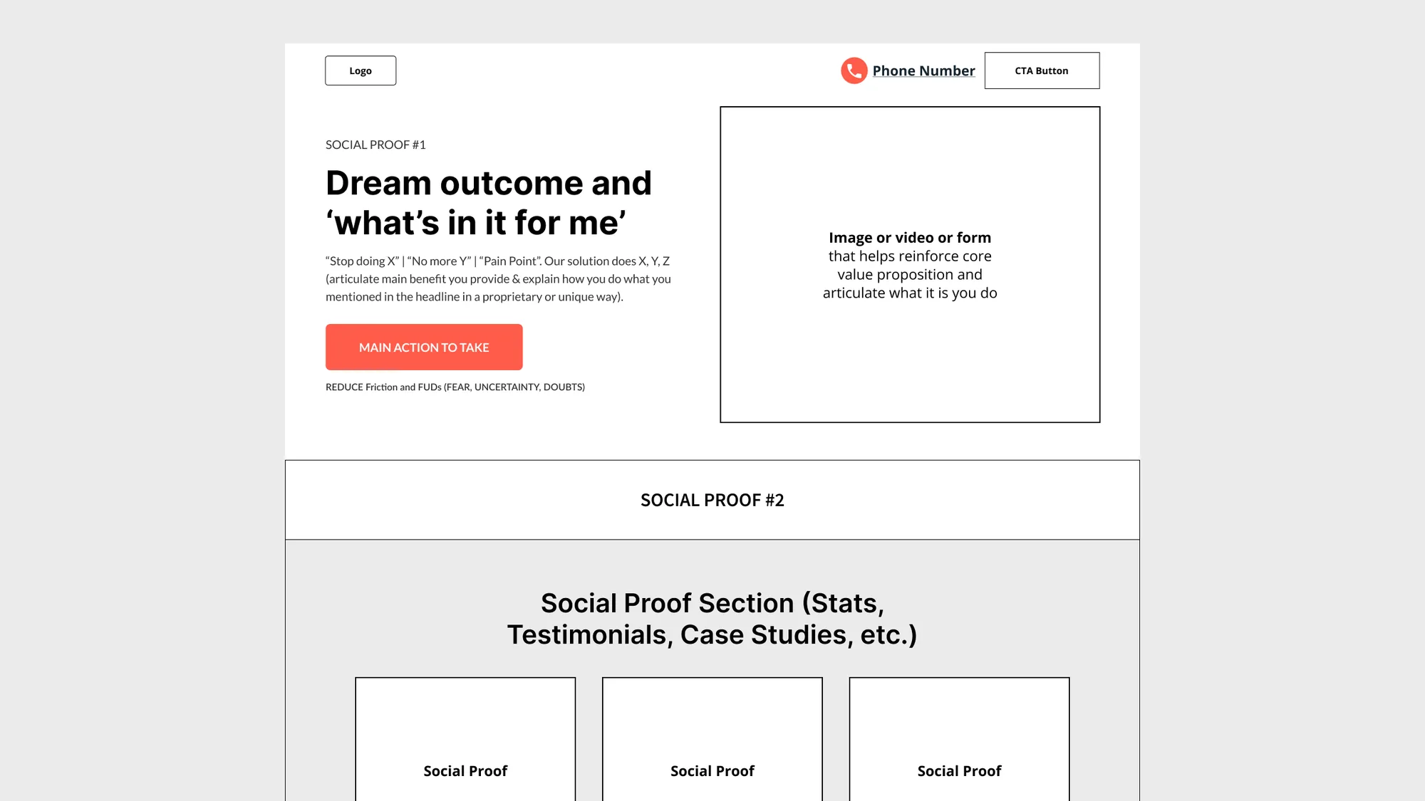
The single biggest lever isn't the wording of your prompt. It's deciding the order of the page before you write a word. A high-converting page moves a reader through a predictable arc: grab attention, name the pain, prove you understand it, show what's different, and make the next step obvious. Every section below is one beat in that arc. Skip a beat and the page feels like it's missing something even when every sentence is fine.
So prompt in sequence. Generate the hero, lock it, then feed it into the sub-headline prompt. Feed both into the pain section. Each step inherits the decisions of the last, which is exactly how the page stays coherent instead of reading like six writers who never met.
The hero headline: three jobs in one line
The headline does more work than any other element on the page, and the way to get a good one out of AI is to stop asking for "a catchy headline" and start demanding a formula. The one that holds up combines three things:
- The emotional dream outcome — the transformed state the customer actually wants. Freedom, status, control, peace of mind. Not the product; the life after the product.
- A functional benefit with a timeframe — the concrete, measurable result, pinned to a real window. "In 24 hours." "Within 14 days." Specificity is what separates a promise from a platitude.
- A unique mechanism or proof element — the reason it's believable. A method, a guarantee, an approval rate.
Stack them and you get something like: Get business funding up to $2 million in 24 hours using your property as collateral (95% approval rate). It's not clever. It's not wordplay. It's a clear picture of who you become, how fast, and why you should believe it.
When you brief the model, give it the formula and an example, then ask for ten variations in a table. You're not looking for one perfect line — you're looking for the range, so you can pick the angle that fits.
The sub-headline: buy the scroll
The headline makes a promise. The sub-headline's only job is to make staying feel worth it. One or two sentences that elaborate the core benefit and lean the reader toward the call to action.
The strongest version names the pain first, then pivots to the mechanism: Tired of emails landing in spam? The only warm-up tool that uses a private network and AI to guarantee better deliverability and booked meetings within 14 days. Pain, then the proprietary "how," then a time-bound payoff that flows straight into the button. Keep it to thirty or forty words. Any longer and it's competing with the headline instead of supporting it.
The pain section: problem, agitate, solve
This is where generic AI copy falls apart, because empathy can't be faked with adjectives. The framework that works is older than the internet: name the problem, agitate it, then resolve it.
Open by talking to the reader, not at them — three pain points phrased as questions they're already asking themselves. Do you… Are you… Have you… Then sit in the problem long enough that they feel understood. Then agitate: make the cost of doing nothing vivid and specific. What's slipping away while they stick with the old way? Only then do you turn toward the solution — and you start by clearing objections ("you don't need to…") before you introduce what they actually do need.
The formatting matters as much as the words. Short sentences. Two lines a paragraph, then white space. Bold the phrases that carry weight. People don't read pain copy, they scan it, and a dense block reads as effort the moment they're least willing to spend it.
The bridge: from pain to proof
Between the pain and your offer sits a small, easy-to-miss section that has to do something subtle — acknowledge the frustration and hint at the fix, in a single line. The mistake is making every one of these a question-then-answer. Vary the shape. A direct warning. A reframe ("It's not aging, it's low T"). A bold claim that challenges what they assume. Mix the formats and the page keeps feeling like a conversation instead of a template.
Value propositions: differentiators, not features
Before you write a single benefit headline, do the unglamorous step most people skip: figure out what's actually different about the offer. Not the generic benefits any competitor could claim — the real, distinct differentiators. If there are only five honest ones, you have five, and padding them to a round number just dilutes the strong ones.
Then turn each into a headline using the same shape every time: an action or experience verb, the specific thing they get, and the emotional payoff. Fast, painless treatment for a lifetime of freedom and peace of mind. Feature plus feeling, answering the only question the reader is really asking — what's in it for me? Keep them concrete, use numbers where you have them, and resist the urge to make all eight sound identical.
The call to action: value, not pressure
A good CTA isn't a command, it's an invitation that makes the next step feel like a gift rather than a risk. The button and the copy around it should answer: what will I get, why now, and what's the catch (there isn't one). Frame it around the prospect's gain — the insight they'll walk away with, the access they unlock — and strip out anything that smells like pressure. Generate a handful of variations and read them out loud; the right one sounds like a helpful person, not a closer.
The real lesson is in the brief
Look back at those prompts and a pattern emerges — and it's the actual takeaway. Every one of them does the same four things: it gives the model a formula, shows it a worked example, demands multiple variations in a table, and explicitly bans the defaults the model reaches for when left alone (the monotone question-answer rhythm, the reflexive em dash, the eight value props that are secretly the same value prop reworded).
That's the whole game. The model is a brilliant executor and a mediocre strategist. When you hand it the structure — the sequence of jobs, the formula for each, the example to match, the ruts to avoid — it fills that structure in better and faster than you could alone. When you hand it "write me a landing page," it hands the strategy back to you, badly. The leverage was never in the model. It was always in knowing what a landing page is for, section by section, and refusing to let the tool guess.