
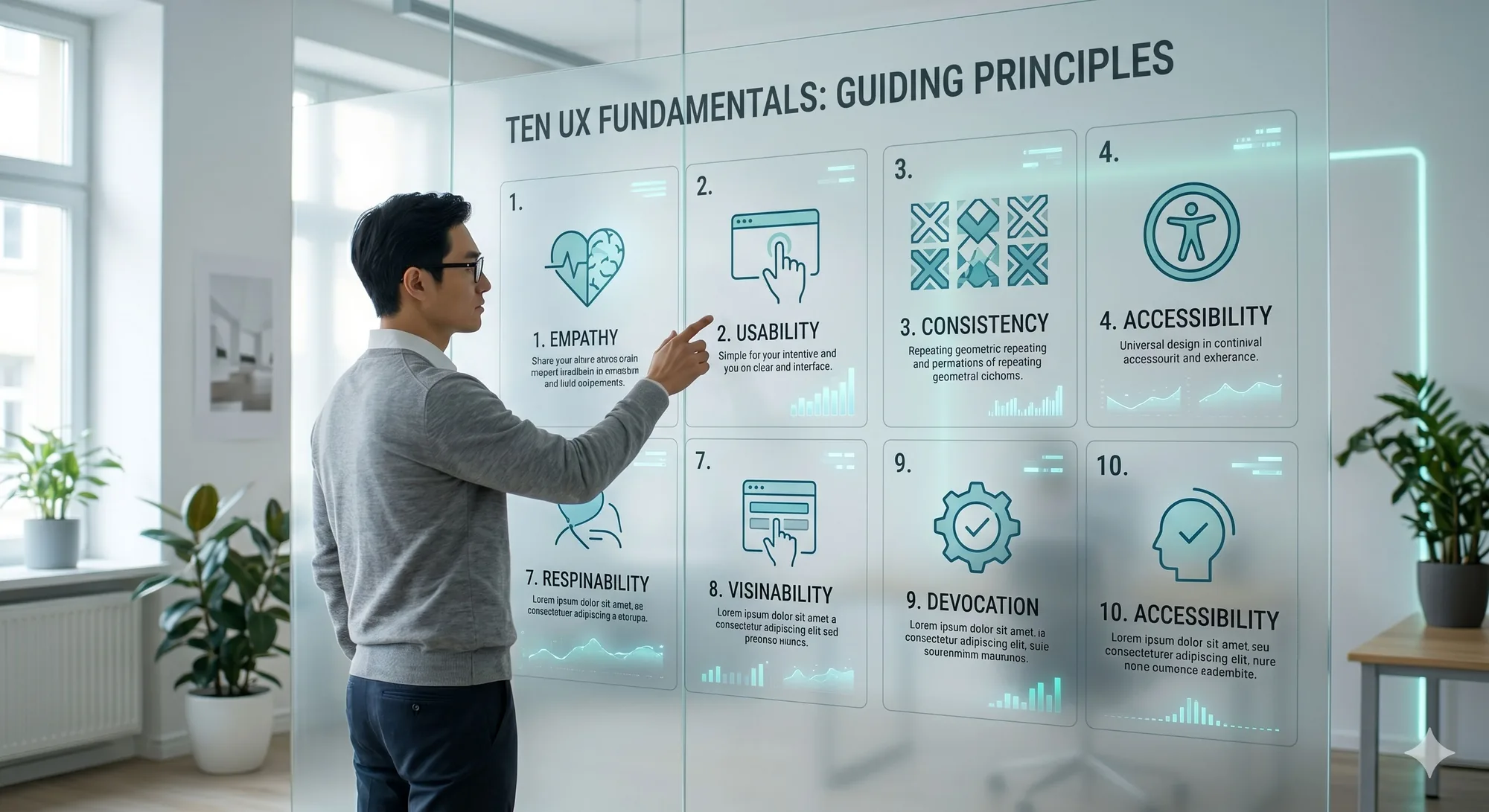
The fastest way to spot a shallow design process is how much it talks about trends and how little it talks about people. Trends expire. The fundamentals below have outlasted every framework and platform shift, because they're rooted in how humans actually think — which doesn't get a yearly update. Here are ten we hold every project to.
1. Start with real people
Research is just learning what users need before you build. Two modes: ask (interviews, surveys) and watch (usability sessions, recordings). The second matters more, because people are unreliable narrators of their own behaviour — what they do rarely matches what they say. You don't need a lab or hundreds of participants; testing with around five users surfaces the large majority of usability problems. Five real users beats a roomful of assumptions.
2. Be relentlessly consistent
Every time a control looks or behaves differently, the brain stops to re-learn it. That tax is cognitive load, and it's pure waste. Keep it consistent four ways: visually (type, colour, spacing), functionally (the same action always does the same thing), internally (coherent with yourself), and externally (matching the conventions people already know from everywhere else). Fight a user's muscle memory and you will lose. Adopt a design system early, even a small one.
3. Always show what's happening
People should never wonder whether the app heard them. Acknowledge every action — a button state, a spinner, a confirmation. The rough timing rule: under a second needs nothing; a few seconds wants a spinner; longer wants a progress bar and, past ten, an estimate so people can go do something else. Skeleton screens work because showing the shape of what's loading makes the wait feel shorter than a blank spinner does.
4. Favour recognition over recall
Don't make people remember; let them recognise. Recently-viewed lists, autocomplete, familiar icons, visible options instead of empty fields — all of it offloads memory onto the interface, where it belongs. If completing a task depends on the user holding something in their head, the design is making them work too hard.
5. Prevent the error, don't just apologise for it
The best error message is the one nobody ever sees. Before you polish the "oops" copy, ask why the mistake was possible at all. Grey out invalid choices, set smart defaults, confirm destructive actions, and always offer undo. Design the guardrail, not just the warning sign.
6. Build it accessible from the start
Accessibility isn't a compliance chore bolted on at the end — it's usability taken seriously. The WCAG shorthand is POUR: perceivable, operable, understandable, robust. It's also good business: you're designing for a huge slice of the population, and the "curb-cut effect" means the fixes help everyone — high-contrast text helps in bright sun, keyboard navigation helps power users. Retrofitting it later always costs more than building it in.
7. Cut until it hurts, then organise what's left
Every team wants its banner, its pop-up, its disclaimer. The user wants to do the one thing they came for. Attention is shorter than ever, so simplicity is survival. Use a simple order of operations: can we remove it? If not, hide it until it's needed. If it must show, shrink it. Then organise whatever survives. For every element, ask whether it helps the user reach their goal — and if it doesn't, it goes.
8. Design mobile-first, for real
Most people meet your product on a phone, one-handed, in bad light, on a flaky connection, half-distracted. Designing for that constrained reality first and enhancing upward beats shrinking a desktop layout down. Practically: touch targets big enough to hit reliably, spacing that prevents mis-taps, primary actions where thumbs rest, and genuine attention to performance — a beautiful page that takes ten seconds to load is not good UX.
9. Personalise for relevance, not creepiness
Relevance is the goal: moving from "here's our content" to "here's your content," whether from stated preferences, observed behaviour, or context. Mind two traps — the cold-start problem (you know nothing about a brand-new user, so seed with a quick preference step or sensible defaults) and the privacy line (be transparent, make opt-out easy, and don't reveal how much you're tracking). Even remembering a name or the last session is a real improvement.
10. Test early, test often
UX is a loop, not a launch: research, design, test, learn, repeat. Assumptions are guesses; only real users tell you the truth. Mix the methods to fit the question — usability testing to find friction, A/B testing to optimise, interviews to understand why. And again, you don't need scale: a handful of users, watched closely, reveals most of what's broken.
The one thing under all ten
Strip these back and they're the same instinct: respect the user's time and mental energy. Done well, none of it gets noticed — nobody compliments your error prevention; they just glide through and get on with their day. That invisibility is the point. The craft is in the friction you removed so no one had to think about it.
Further reading: UX Pilot's 10 UX best practices to follow in 2026.